Before you understand what is a Histogram, you are advised to read:
What is Grouped Frequency Table ?
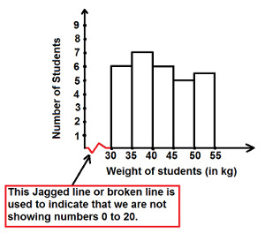
The graphical representation of data of class interval is called as Histogram.
Or in other words, A Histogram is a bar graphs that shows data in intervals.
Or we can also say that: A Graph which represents grouped frequency table; is known as Histogram
Since there is no gap between the class-intervals, there is no gaps between the bars of histogram too and height of bar represents the frequency of class interval.
Example : In a class of 30 students, following numbers represents weight of these students:
30, 31, 51, 35, 40, 39, 42, 43, 36, 49, 44, 33, 37, 47, 52, 38, 32, 50, 39, 40, 45, 46, 53, 35, 31, 41, 51, 33, 46, 53
Put the data in groups and make a Grouped Frequency Distribution Table (as shown below):
| Groups (Weight in Kg) | Frequency (No. of Students) |
|---|
| 30 - 35 | 6 | | 35 - 40 | 7 | | 40 - 45 | 6 | | 45 - 50 | 5 | | 50 - 55 | 6 | | Total | 30 |

|


